Aesthetic and emotions of fonts
- Words have dictionary definitions (denotations) and emotional associations (connotations).
- Fonts can help communicate both types of meanings.
fonts that work together
text font
The text font should be, first and foremost, legible for large bodies of copy. 12-16 px
display font
A display font adds contrast, interest and emotion that the original font doesn’t. The display font is typically 18 px or bigger and used in moderation–not too many words and not too many instances.
concord and contrast:
- Fonts that are too similar create tension and clutter.
- Fonts that are too different have no unity.
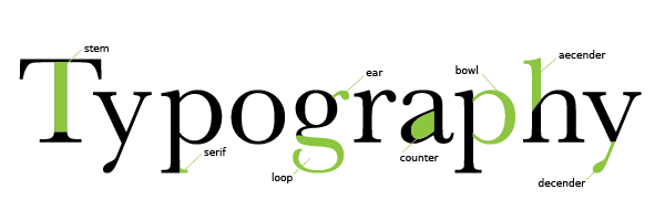
- When picking two font that match, they should have similar structure: bowls, extensions of ascenders & descenders, x-heights
illustrator :
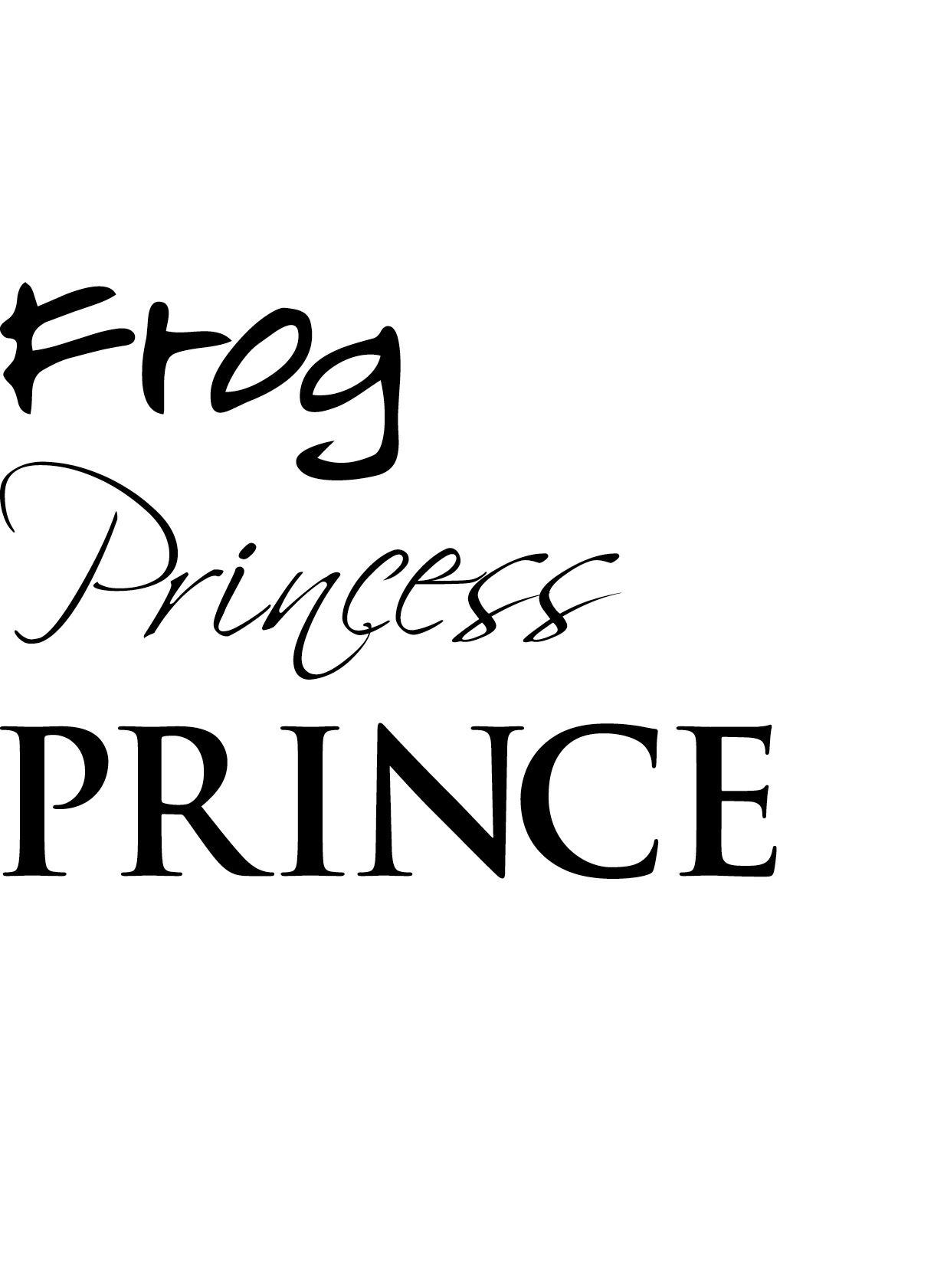
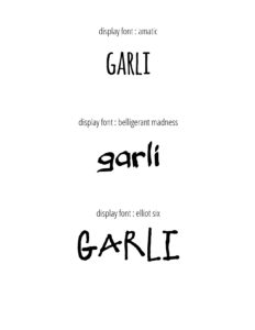
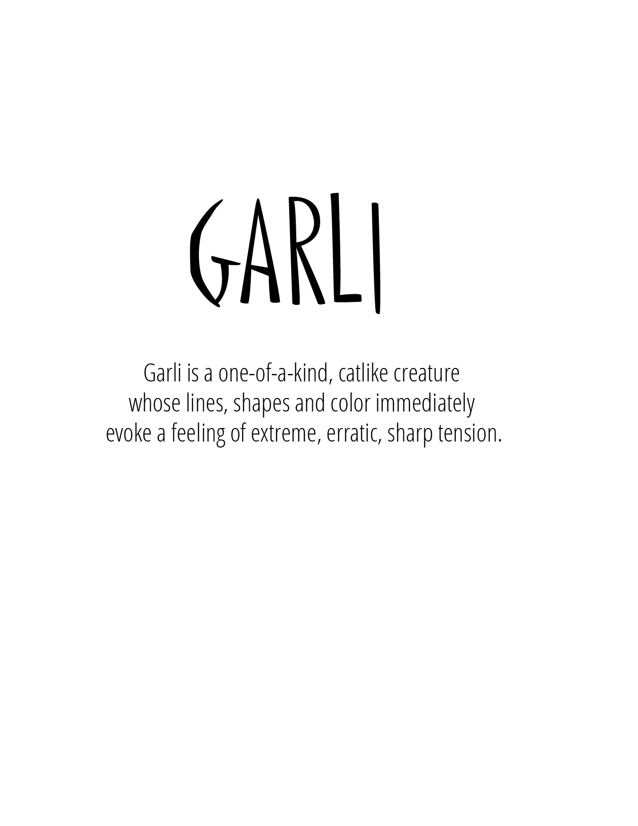
- Find three display fonts that match the emotion of your character.
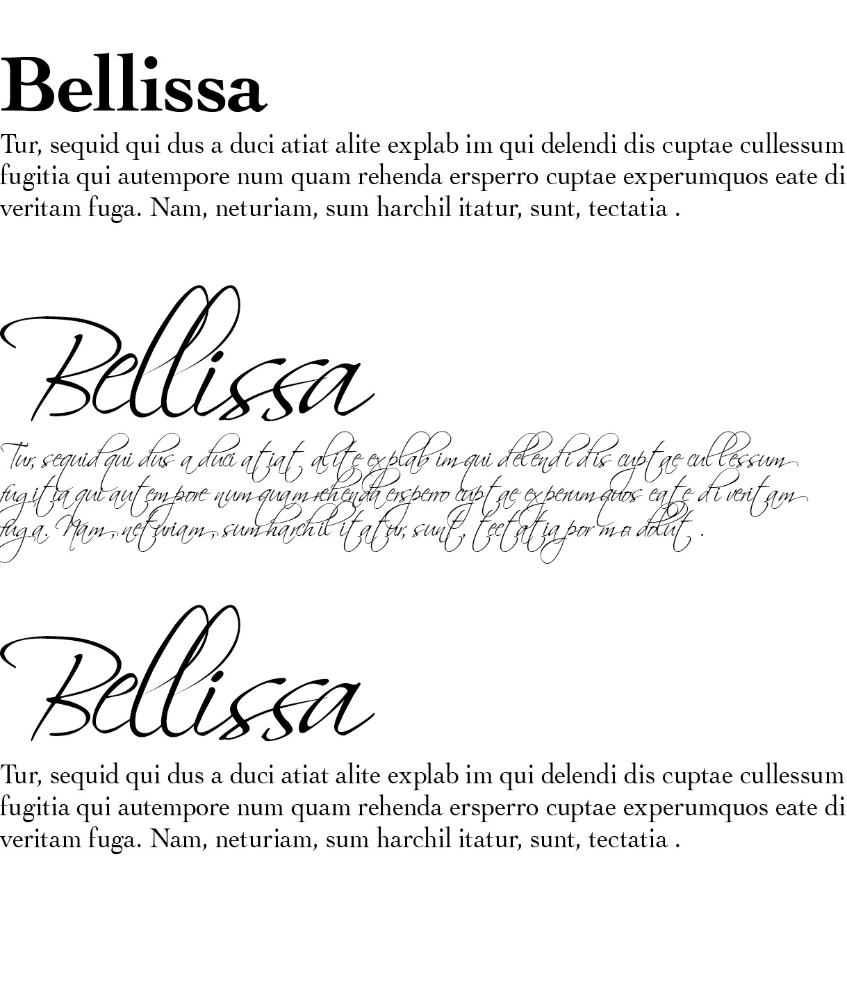
- Find a text font that matches the display font. Here are two possible sources for fonts :
font squirrel google fonts - Start a new illustrator file and save as “fontstudy.pdf”.
- Using the example below, show the fonts you selected with their name.
- Review the three fonts with two others in the classroom. What emotional responses do they have to the fonts? Write down their descriptions.
- Choose the font that you think works best and explore it in two ways:

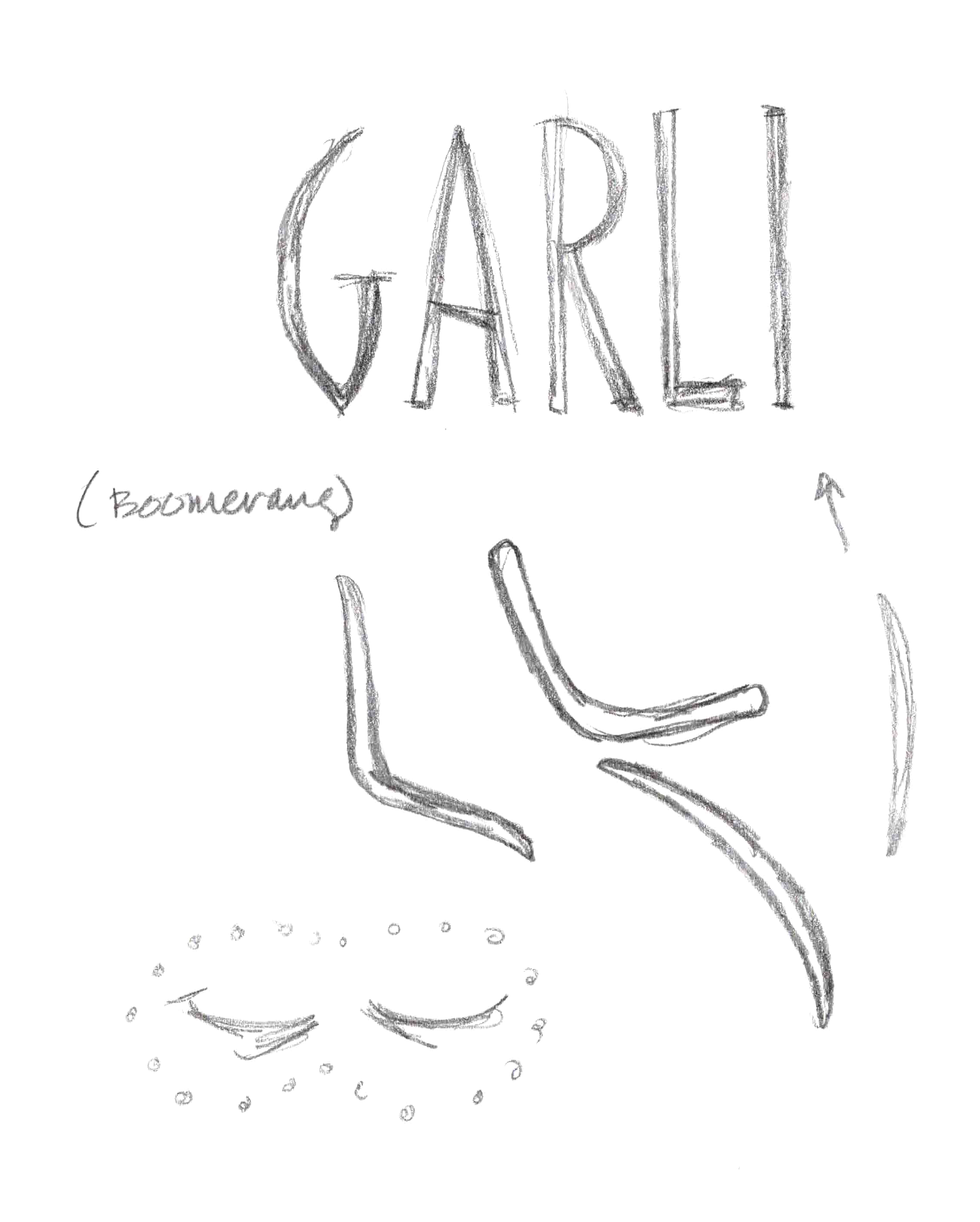
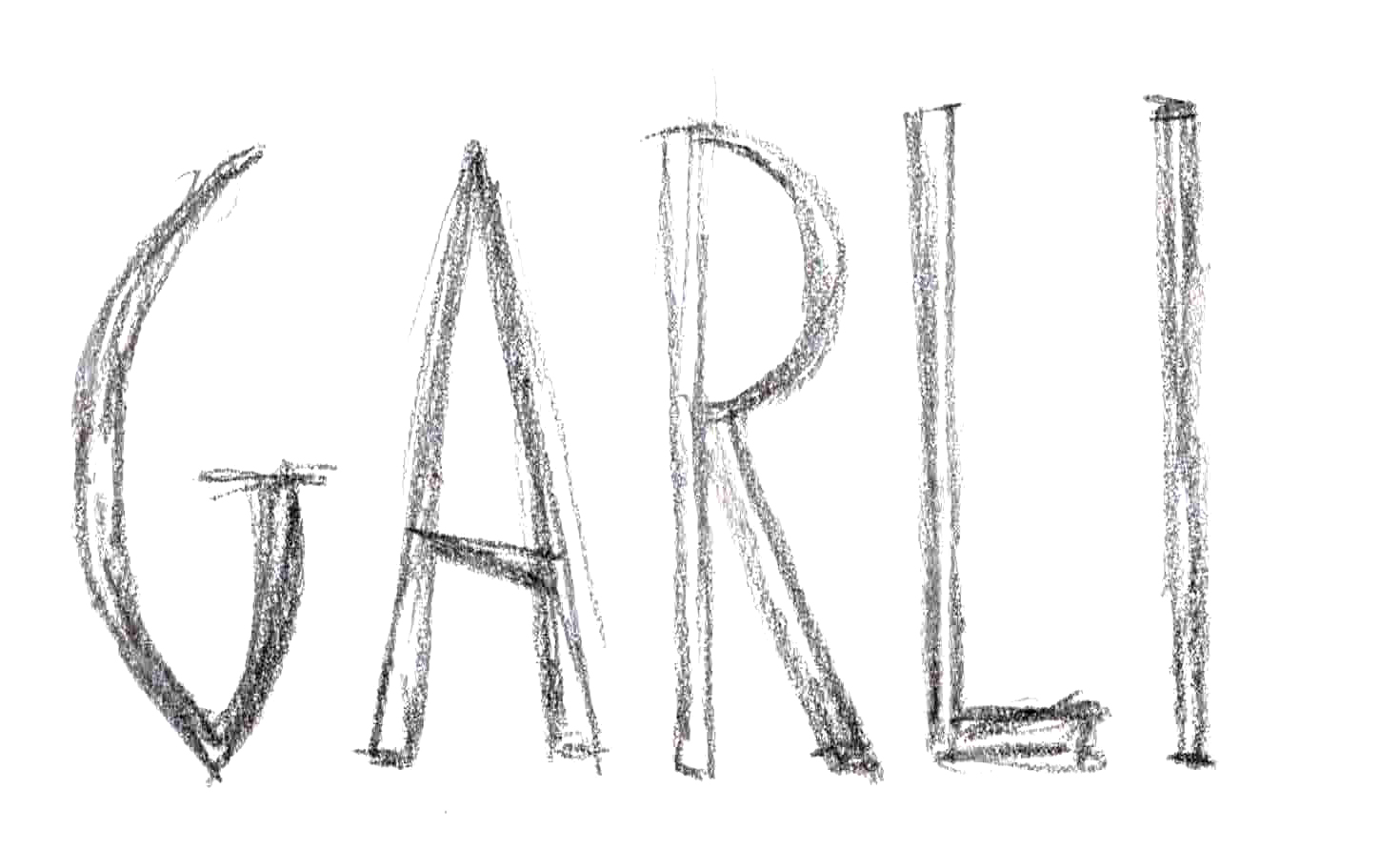
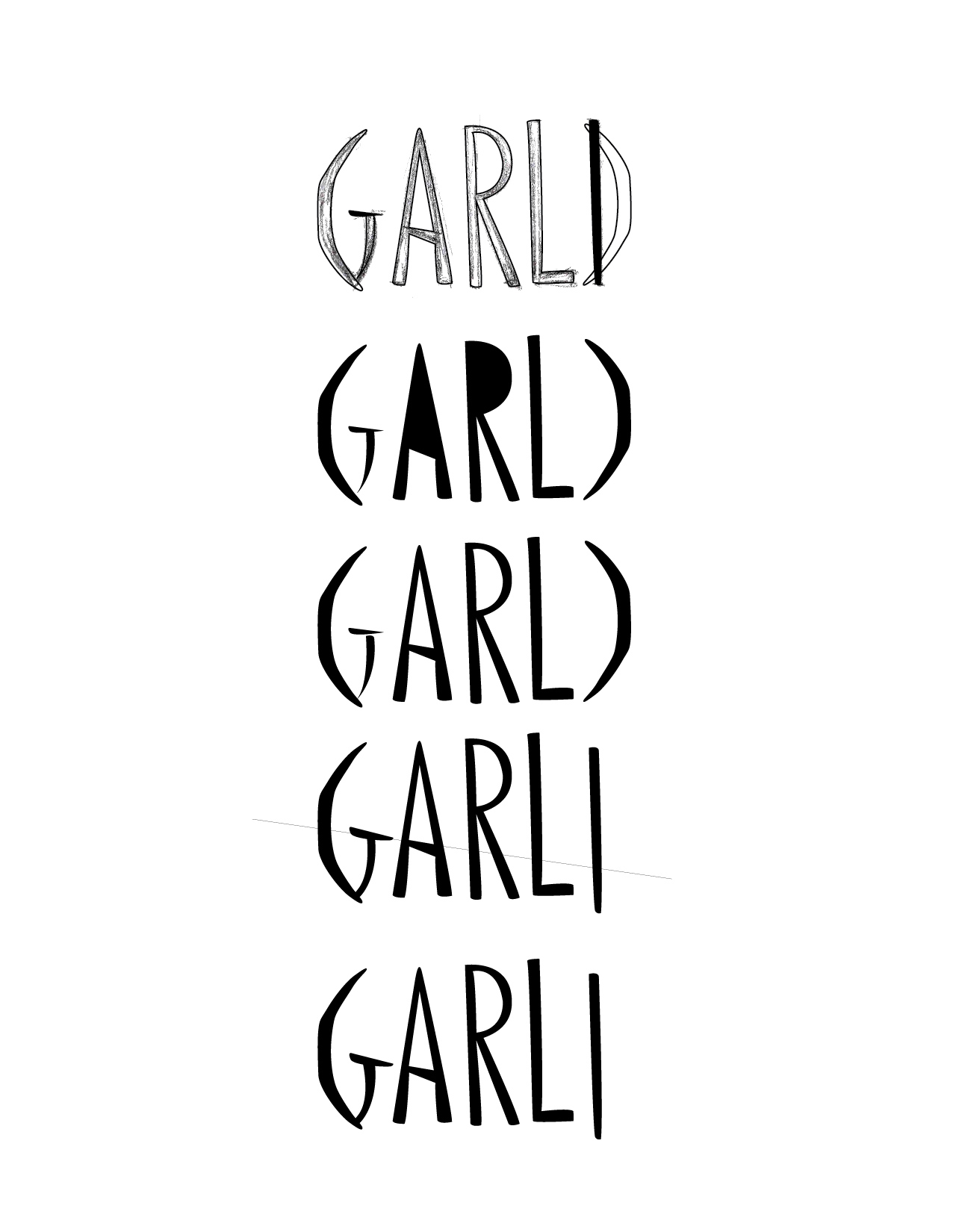
sketch : with the font on your screen and paper and pencil, sketch the font. Try to bring include your character’s shape and/or visual metaphors.
modify the type : while in illustrator and selecting the type, create outlines for it. (type -> create outlines). Use the direct selection tool to edit the font.
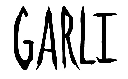
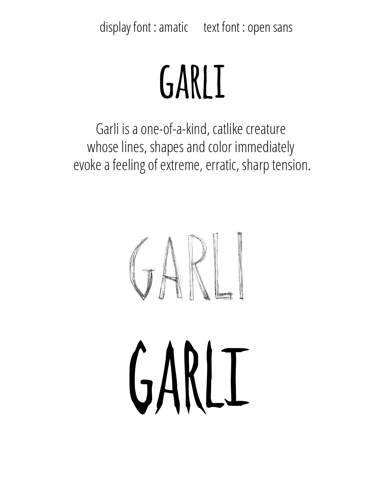
Choose one version and refine it further. If using the sketch, trace it first.
Pair up your final display font with your text font:
download font_study