reading assignment:
10 beautiful website color pallettes
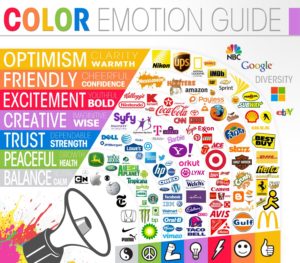
why is color important?
- color creates brand recognition
- colors have the power to elicit an emotional response
- color can be a powerful tool to guide the user
- bad color can be distracting
print : CMYK : cyan, magenta, yellow, black
subtractive color : combines pigment to produce color; used for printing
web : RGB : Red, Green, Blue
additive color : combines light to produce color used on monitors, tvs, digital cameras
color formats:
rgb : rgb(153,153,153)
hex : #cc3399
qualities of color:
- hue : red, green, blue… what color is it?
- saturation : is it pure color or diluted?
- brightness : is it light or dark
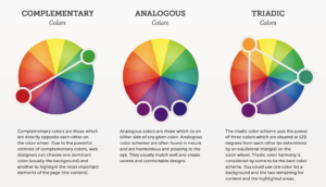
harmonious color/color groupings
- analogous
- monoghromatic
- complementary
- triadic
illustrator
Now that your character has form, lets develop a color palette for your entire project. From the readings, you’ll understand why it’s important to use color wisely. Too many colors can distract the user. For now, lets try to use only three colors with tints.
When choosing colors, keep the following in mind:
- emotional response
- mind map nouns : do these knowns provide a color theme?
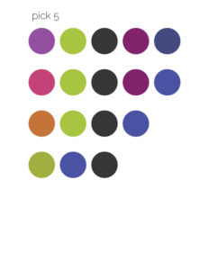
Here are three methods to help you pick a palette : pick 5, complimentary and from art. Develop three themes and then choose your favorite.
pick 5
- create a new file in illustrator
- open the swatch palette : window -> swatches
- use the small menu tab in the corner -> select all unused -> delete
- create a new swatch (click new page icon at the bottom)
- name your first color. (“purple”)
- select color type : spot color
- color mode : hsb
- adjust the bars until you have the color you want and click ok
- create four more colors
- using the shape tool, create five shapes and fill with your colors
- refine your colors and reduce to three, as demonstrated in class
- save as color study
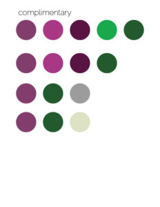
complimentary
- copy one color circle
- create a new art board and paste
- go to adobe and find the complimentary color
- screen capture the bar of color, save to desktop and place in illustrator
- create swatches with your dropper tool
- condense down to two colors and pick a neutral for a third color
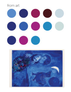
from art
- search online for an art image with color that you like and place it on a new page
- create a new art board with five circles
- continue choosing colors until you have three that you like
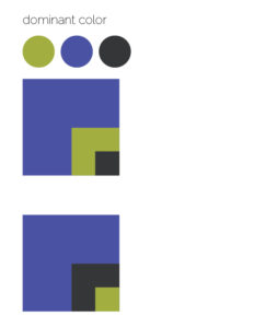
dominant color
Examples in our reading showed how powerful use of color can be. A dominant color can set the mood for your entire project. An accent color should be used sparingly to get attention. Set up boxes to explore which of your final colors should be dominant and which should be the accent color.


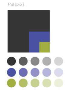
final colors
Place your final dominance cube on a new page. Create tints of your colors below it.
tints
- copy one color color circle
- create a new art board and paste; make 5 in a row
- double click the swatch and copy the hex color code
tools: circle, square, window->align, edit ->paste in front, dropper tool
color your character and save.
resources: