10 Beautiful Website Color Palettes That Increase Engagement
by David Zheng
Last updated on July 3rd, 2018
Is the color scheme you’ve chosen for your website triggering a desired response?
Does your website color palletes are good?
Everyone has favorite colors they tend to gravitate towards when it comes to their work or otherwise.
But a skilled designer understands the importance of evaluating a color scheme based on the brand, the meanings of the colors, and the products or services being promoted.
Good color choices take careful planning.
It can influence how a visitor interprets what they see as much as a site’s layout and typography — and when done well, it can have a positive impact on each visitor’s evaluation of the brand as a whole.
In this article, we’ll take a look at why selecting the right colors for your site matters, as well as ten different color palettes from real sites that are effective in grabbing visitors’ attention.
See how to use our tools to know wich color is working better
Why is color scheme so important?
Before we jump into the process of selecting a color scheme for your site, it’s important to understand exactly why your color scheme matters so much.
After all, you might be thinking that it’s the content that really matters.
And that’s not untrue.
But your color scheme can have a major impact on how visitors interact with your content, and how they perceive your brand as a whole.
So as you select the palette you use for your site, aim to accomplish the following five goals:
1. Create brand recognition
Your site is essentially your company’s home online.
That means it needs to be an accurate representation of your brand. And beyond that, it needs to be memorable enough that users will return after their first visit.
After all, many of your visitors won’t be ready to make a purchase or other major conversion during their first visit — and they need to remember your company in order to come back and take those actions.
Fortunately, color increases brand recognition by 80%.
So if your company already has an established color scheme, it’s essential to include this in your site’s design. This will make it much easier for visitors to immediately connect it with other places they’ve seen your brand.
Plus, if your color scheme is consistent across your entire site, they’ll know they’ve come to the right place when they return, regardless of the exact page they land on.
Beyond telling users who your company is, your web design also plays a major role in users’ snap judgments about your brand.
According to one Google study, users form their opinions on a website within 50 milliseconds.
And not surprisingly, those opinions are primarily based on design.
In fact, in one survey, 46.1% of people said a company’s web design is their top criteria for discerning that company’s credibility, and 42% of shoppers said they base their opinion of a website on design alone.

Of course, web design involves much more than just color.
But given that color is one of the most obvious elements on your site, and one of the only ones a user can discern within those initial 50 milliseconds, your palette can make or break a user’s assessment of your company.
2. Shape how visitors feel about your site
In another study on how site consumers’ first impressions are formed, 90% of initial assessments are based on color alone.
To a certain extent, the reason for this is clear.
After all, color is one of the easiest aspects of a page to “understand.” It can be assessed almost instantaneously and doesn’t require visitors to evaluate copy or other messaging.
But it’s also important to consider the role that the psychology of color plays in these snap judgments.
Colors have the power to elicit an emotional response, and different emotions are associated with different colors.
Many companies take advantage of these connections, as illustrated by the logos in the following chart.

For example, brands who want to create a sense of creativity and imagination tend to incorporate purple into their imagery, while brands who want to establish a sense of balance and calm lean towards black and white.
This ties directly into the “personality” you want your brand to have.
In one study on brand personality, psychologist and Stanford professor Jennifer Aaker concluded that five core dimensions play a role in a brand’s personality:

Brands can sometimes mix traits, but for the most part, their “personality” is centered primarily on one. A company that sells camping gear, for example, would identify with “ruggedness,” while a fashion brand would likely aim for “sophistication.”
And as you can see in the logo chart above, color can play a major role in showing consumers what your brand’s personality is like.
Although a view may not consciously realize that a company’s red logo is designed to create a feeling of excitement, it can still do exactly that.
And while each color can serve to create a specific feeling or reaction, certain colors are better choices than others for the majority of brands and websites.
For example, blue is often considered the safest choice. This is, in part, because it’s the most common “favorite” color among the majority of the population.
In fact, 57% of men and 35% of women say it’s their favorite color.

So if you’re looking to appeal to a wide audience, this could be a great choice for your site. In fact, this might be why some of the most-visited sites today, like Facebook and Twitter, use it for their logos and branding.
It’s also worth noting that blue is also commonly associated with feelings of trust, authority, and reliability.
But that doesn’t mean it’s the best choice for every site. It all depends on the feeling you want to convey to your visitors.
For example, if your brand centers on health and wellness, green could be a better option for creating that association. And if you want to get your visitors excited and drive them to take action quickly, red could be more effective for helping you accomplish that goal.
So as you select colors for your site, consider the emotional reactions they might drive in your visitors.
For example, if you’re trying to create a sense of tranquility for your yoga studio’s website, red might not be the best choice — and it’s best to know that before you invest serious money into your design.
3. Develop a sense of order
Aside from the emotional responses the individual colors you choose might evoke, it’s also to consider the way the colors within your site interact with one another.
The best way to do that is by looking at a few basic principles of color theory.

If you’ve ever taken an art class or looked at any design-related resources, you’ve probably seen something similar to the color wheel in the graphic above.
The most common concept illustrated within this wheel is the relationship between primary colors (red, yellow, and blue), and the secondary and tertiary colors that are formed by mixing them together.
But beyond that, this wheel can help you create color harmony or a visually pleasing arrangement of colors. A harmonious palette can help you establish a sense of balance and order.
There are three widely-accepted types of color schemes you can use to establish this type of harmony: analogous, monochromatic, and complementary.
An analogous color scheme is made up of colors that fall side-by-side on the color wheel. This is one of the most difficult palettes to do well since the colors can easily overpower one another.
That being said, analogous color schemes are also some of the most vibrant. So if you want to create a colorful, visually interesting site, you might do well with a palette similar to the following three examples:

A monochromatic color scheme falls on the opposite end of the spectrum from the previous type. As the name implies, it’s made up of one main color, but the intensity and lightness of the shades vary.
These palettes are some of the easiest to create and the “safest” to implement because varying shades of the same color rarely ever clash or feel too busy.
So if you’re going for a relatively simple look on your site, a monochromatic color scheme like these three could work well for your brand:

Finally, a complementary palette falls somewhere between analogous and monochromatic schemes in terms of variety.
It’s composed of colors that lie directly opposite of each other on the color wheel. So while it involves more colors, those colors naturally complement each other and won’t overwhelm visitors.
If you want to include some variety in your color scheme without making your site appear too busy, a complementary color scheme like one of these could be the perfect choice:

Of course, these three aren’t the only types of color schemes you can create. In fact, the best palette types vary based on who you ask.
At Kissmetrics, for example, a triadic color scheme is listed as one of the main options.

This color scheme involves using three colors that are situated 120 degrees from one another on the color wheel. In the graphic above, those colors are orange, green, and purple.
So as you select your colors, remember that the types listed above aren’t definitive rules. They can give you a general idea of the overall feel you want your site to have, but they’re by no means the only ways to create a palette that works for your brand.
Regardless of the type of palette you go with, you can use it to create a hierarchy of the most important content on each of your pages.
For example, take a look at this screenshot from StudioPress:

Which elements on the page do you notice first?
The red banner, buttons, and links, right?
That’s because the red accent color is used sparingly — so the elements that use it stand out as the most important on the page.
The other content, in varying shades of gray, provides a complementary backdrop and makes for an easy reading experience. But it’s clear even at first glance which elements are intended to stand out.
The same holds true for this example from Give Beyond Me.

Even though this color scheme is extremely different from (and much brighter than!) the previous StudioPress example, it’s equally effective at singling out important elements.
Once you’ve selected your color scheme, you can use this same approach on all of your pages. And make sure to stay consistent throughout your site.
Use certain colors for your body sections and copy, slightly different colors for your navigational elements, and standout shades for your calls to action and other important buttons and links.
This way, as visitors move through your pages, they’ll always have a sense of how to navigate your content and find the most important elements.
Creating a sense of hierarchy makes it easy for users to interact with your site the way you want them to. And the more effective you become at accomplishing this goal, the more successful you’ll be at driving users to convert.
4. Make certain elements stand out
As I mentioned in the previous section, a defined color website palette can be helpful for signifying that certain elements are important.
You can maximize this impact by keeping the Isolation Effect in mind as you determine how to use your color scheme on your pages.
The general idea behind this psychological principle is that the more an item stands out, the more likely it is to be noticed and remembered.
For example, take a look at this landing page from T-Mobile:

What’s the first thing you’d be inclined to click on this page?
If you’re like most people, the answer is probably that hot pink “Get the details” button.
Of course, hot pink is naturally an attention-grabbing shade. But it’s even more attention-grabbing thanks to its contrast with the rest of the primarily white page.
If the same element were placed on a light pink background, it wouldn’t be nearly as striking.
Now, take a look at this landing page example from MailChimp:

The bright blue button stands out because it clearly contrasts with the light orange background. Even if the gray text doesn’t immediately catch visitors’ attention, there’s no way they’ll miss the call to action itself.
So if you know that you want to achieve this level of contrast, keep this in mind as you select your palette.
Make sure that the colors you choose give you the ability to make certain calls to action stand out on your pages without clashing with the rest of your design.
This approach is in line with most consumers’ preferences, too.
In two studies, Aesthetic Response to Color Combinations and Consumer Preferences for Color Combinations, researchers found that while consumers prefer color combinations with similar shades, they also favor palettes with a highly-contrasting accent color.
The first study showed that “pair preference and harmony both increase as hue similarity increases.” But, “although pairs with highly contrastive hues are generally judged to be neither preferable nor harmonious, figural color preference ratings increase as hue contrast with the background increases.”
The more your accent color contrasts with your background, the more your visitors will like your palette.
In the second study, researchers found that, “people generally like to combine colors that are relatively close or exactly match, with the exception that some people highlight one signature product component by using contrastive color.”
So although your accent color should have a strong contrast, it’s okay — and even preferable — if the rest of your palette is made up of relatively similar shades.
This means that creating a palette that includes one strong, attention-grabbing accent color is not only effective for isolating certain elements but is also a great way to create a combination that many of your visitors will like.
5. Simplify design-related decisions
When it comes to running a website or a business (or both!), it’s always a good idea to look for ways to simplify basic processes.
After all, the less time you spend on basic tasks, the more time you’ll have to spend on processes and decisions that have a bigger impact on your success.
And establishing a palette is a great way to cut down on the time it takes to create new pages. When you have an established color scheme, you make basic design choices much easier, both for yourself and for your designers and developers.
This is especially true if you take the time to document your palette in an easy-to-use way like this business did:

When you create a user-friendly document of your palette, you create an at-a-glance resource with all of the possible options for each element.
This way, if you (or your designers) are having trouble determining which color to use for a CTA button, you can simply reference the document for a complete list of your options.
So instead of racking your brain for all of the various possibilities, you can choose from a pre-set list of colors. And once you select a few to use or test, all of the HEX and RGB codes are already right in front of you.
For more complex palettes, you can also create custom naming conventions that work for your team, like UXPin did.

In this case, each of the colors at the top is the main shade the brand wants to use on their site. To keep things simple, they refer to these colors with the prefix “base.”
So the colors in the top row are “base-blue,” “base-gray,” and so on.
But below that, they also include varying shades of each color, with names that signify their difference from the base, like “blue-darker-15” and “gray-lighter-25.”
Beyond providing plenty of options, this method also eliminates design inconsistencies.
For example, if someone on the marketing team wanted to incorporate a lighter shade of blue into a landing page than the base color, they could easily explain this to the design team by asking for the color’s exact name.
This way, even if they added hundreds — or even thousands — of pages, they could be confident that each one was made up of the same shades of their chosen colors.
This provides a cohesive user experience and shows each visitor that they’ve come to the right place, regardless of the page they initially land on.
How many colors should you include?
One common question that site owners have about creating color palettes is how many colors they need to include.
Unfortunately, there’s no definitive answer to this question.
That’s because different designers and site owners have different opinions on what a visually appealing page looks like.
Of course, we can all agree that a page with tons of contrasting, bright colors, like this example from Pine-Sol’s old site, feels too busy.

But where exactly is that line drawn?
And what’s the minimum you can use?
That’s where things get a little more subjective.
But in general, your palette should include different colors for three main elements:
- Background. This will be the most-used color on your site and will set the general tone and feel.
- Base. You can use this color to break up the background and create different sections within your pages.
- Accent. This will be your least-used color in terms of the space it takes up on your site, but will be used for some of your most important elements and give your pages personality.
These elements are all important regardless of the type of palette you choose.
To illustrate how this can work, let’s take a look at what a site might look like using the analogous, complementary, and monochromatic examples from above.
Using the first analogous palette, there are a few ways you could design a page:

Both of these options are built from the same exact palette but create very different overall looks. And although opinions on whether either “work” or not are subjective, it’s easy to see that both break up the page and call attention to the accent-color element.
With the palettes from the complementary example, then, your options might look something like this:

Again, you might like these options, or you might hate them — but in a general sense, they accomplish what they’re designed to do, which is provide a user-friendly experience.
Using one of the monochromatic schemes, your pages would turn out more subdued, like these:

These pages are much simpler than the previous examples. But the fact that they don’t have quite as much variety doesn’t render them any less effective at making up easy-to-use pages.
So as you design your site, you should aim for a minimum of three main colors.
From there, it’s essentially a matter of taste and what works best for your company’s brand.
In addition to the number of colors you should use, there are also varying opinions on how prominently each color within your palette should feature on your site.
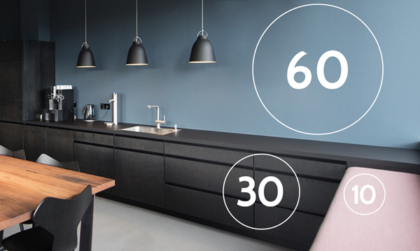
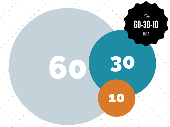
For example, some web designers prefer to follow the standard “60-30-10 rule” that was originally popularized by interior designers.
This design approach involves three different colors that take up varying portions of a space.
- 60%: Primary color. This color should create the overall unifying theme of the design.
- 30%: Contrast color. This shade should contrast with the primary color to create visual interest.
- 10%: Accent color. This should complement either your primary or secondary color and stand out in the space.
When applied in a home, this principle creates a result that looks something like this:
That said, if you opt to use this rule as a starting point, it’s important to remember that you’re choosing colors for a site, not a room in a home.
In many cases, this means that you can make bolder choices. For example, while you might not want to use the following palette in your kitchen, it could make a great landing page:
That’s because when an interior designer selects colors, they don’t need to worry about drawing attention to certain parts of a room, so the contrast isn’t an essential convert.
While some homeowners might prefer “pops of color,” they aren’t necessary to create a cohesive feel in a room.
As a result, a room palette might look something like this:

This shades of blue and green complement each other nicely, and could make for a visually pleasing living room or bedroom.
But as for a site?
They’re probably not ideal.
Consider a page with that first shade of blue as the background. Which color would you use for the body copy on that page?
That’s a tough choice — because none of those colors would work.
They’re all too similar to the background color, which would make for an extremely poor reading experience.
For example, take a look at the varying levels of contrast in the following blocks of text:

The “Low” text is technically readable. But reading it isn’t a pleasant experience — and that’s what you’d end up with if you used a palette similar to the one we just looked at.
In fact, I wouldn’t expect many users to stick around longer than a few seconds on a page with that palette.
But does that mean a site made up of blues and greens can’t be done well?
Of course not!
Just take a look at this adjusted palette based on that same shade of blue, with additional blues and greens:

The biggest difference here is the amount of contrast between the lightest and darkest shades.
Although the basic colors didn’t change, this palette would result in a much more user-friendly site, because the text would be a lot easier to read.
So if you decide to base your choices on the 60-30-10 rule, remember: you’re designing a website, not a home.
And beyond that, it’s important to note that these percentages aren’t definitive rules.
You can add colors and adjust proportions depending on your design preferences, as well as your site’s complexity.
After all, a page with multiple sections, various calls to action, and different navigation bars will likely require much more variety in color than a simple, straightforward landing page.
So again, it comes down to what works best for your site.
At this point, you’ve likely realized that while there are a few general best practices for creating a color palette, your options are virtually limitless.
And while that means you have tons of freedom over your design, it can also make it difficult to identify a logical starting point.
That’s a common issue for many businesses who are launching a new site or a redesign — which is why we’ve put together a list of ten palettes you can use as inspiration.
So whether your company is a bakery, a SaaS company, or a retailer, you should be able to find something here that helps you in the design process.
Let’s get started:
1. Mea Cuppa
Our first example comes from bakery and coffee bar Mea Cuppa

The colors used in this palette are:
- #191919
- #DFE2DB
- #FFF056
- #FFFFFF

This color scheme is primarily neutral, with black and gray giving it a classy and elegant feel. But the yellow pop of color lightens the mood and lends a more “fun” tone.
Overall, this creates an appropriate tone for an upscale mobile cupcake bakery.
The lesson here is that even one contrasting color can elevate a minimal color schemeand make for a unique, impactful site.
2. The Big Top
Next, let’s take a look at recruiting and career site, The Big Top:
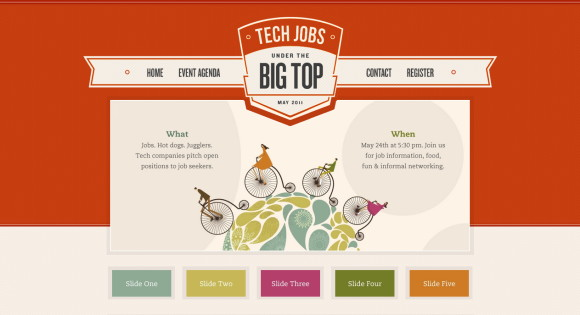
The colors used in this palette are:
- #C63D0F
- #3B3738
- #FDF3E7
- #7E8F7C

This is a great example of an analogous color scheme, with varying shades of red and pink making up the bulk of the page.
Color schemes like this are among the simplest to create, as they can be adjusted by manipulating their tone, shade, and tint. In doing so, you create light contrast which draws the eye into the design more easily.
The design is elevated further by a custom color scheme on the slide navigation, which adds a striking twist to an otherwise subdued palette.
3. Tori’s Eye
Our third example comes from Twitter visualization tool Tori’s Eye.

The colors used in this palette are:
-
- #005A31
- #A8CD1B
- #CBE32D
- #F3FAB6

This is a great example of a mostly monochromatic color scheme. Here, we see the effects of a simple yet powerful color palette centered around shades of green.
This color scheme is often easy to pull off, as one shade of a color will almost always work with another shade of the same color.
If you’re looking to create a similarly cohesive feel for your site, aim to reduce the number of unique colors you use, and maximize the number of shades you use for each.
In this example, Tori’s Eye also incorporates pops of blue and red. But one of these colors could be eliminated to make the page even more harmonious.
4. Event Finds
Next, take a look at this page from event-planning tool Event Finds:

The colors used in this palette are:
- #558C89
- #74AFAD
- #D9853B
- #ECECEA

This is another almost monochromatic site, and you can see the effect of using many tints of one hue in the above screenshot.
Event Finds also achieves striking contrast by using a bright orange color for important call to action buttons. Given that orange and blue are directly across from one another on the color wheel, it’s no surprise that this combination works well on the page.
5. Cheese Survival Kit
The company Cheese Survival Kit sells exactly what you’d imagine: kits with “essentials” like cheese boards, honey, crackers, jam, and cheese knives.

The colors used in this palette are:
- #2B2B2B
- #DE1B1B
- #F6F6F6
- #E9E581

For many websites, the logo is designed first, and the color scheme is dictated from there. This is evident in the Cheese Survival Kit website, which is centered around the logo’s shades of gray and red.
These contrasting colors also make for an impactful visual impression.
From there, the yellow accent color nicely highlights important details. It’s used sparingly, as bright colors typically should be, and as a result, it doesn’t overwhelm visitors.
A splash of color here or there will draw the visitor in. But when used everywhere, it loses its impact — and the Cheese Survival Kit site expertly avoids this mistake.
6. Nordic Ruby
Our next example is Nordic Ruby, a conference and spa retreat for designers and developers.

The colors used in this palette are:
- #7D1935
- #4A96AD
- #F5F3EE
- #FFFFFF

This site uses a neutral background, along with highly-saturated colors for a large chunk of the elements.
The plum color is featured prominently in the header, as well as in lower sections, but is kept in check by the light gray background. The teal shade also serves as a nice contrast, calling attention to important calls to action like the “Register Now!” button.
7. Lake Nona
Lake Nona is a planned community of neighborhoods, schools, recreational facilities, retail centers, and entertainment venues.

The colors used in this palette are:
- #E44424
- #67BCDB
- #A2AB58
- #FFFFFF

Considering that the community places emphasis on a healthy, sustainable lifestyle, it makes sense that they’d go for a palette that evokes a fresh, natural feeling.
The heavy use of shades of green subtly highlights their prioritization of wellness, and the blue elements complement those shades nicely.
The red accent, then, livens things up and keeps the page from feeling at all dull.
8. LemonStand
LemonStand is eCommerce platform designed to help web developers, agencies, and brands create customizable online stores.

The colors used in this palette are:
- #404040
- #6DBDD6
- #B71427
- #FFE658

This website features a triadic color scheme, with blue being the primary color. Shades of blue and gray make up the bulk of the page and establish a sense of professionalism.
The pops of yellow and red, then, are extremely effective in creating contrast, and the yellow buttons in particular direct visitors to important calls to action.
Again, because these bright colors are used sparingly, they have much more potential to elicit an action than those that make up more elements on a page.
9. Mint
Next, let’s take a look at this landing page from personal finance app Mint.

The colors used in this palette are:
- #585858
- #118C4E
- #C1E1A6
- #FF9009

As a personal finance software provider, Mint needs to establish a sense of professionalism to earn the trust of its audience.
In this case, they were able to do just that — while using fresh accents of green and orange to prevent their brand from coming across as boring.
The use of subtle gradients and shadows gives the page an extra “polish,” and the accents are noticeable enough to inspire desired actions, without overwhelming visitors.
10. Odopod
Our final example comes from digital design agency Odopod.

The colors used in this palette are:
-
- #191919
- #DF3D82
- #FFFFFF

Leave it to a design agency to create one of the boldest examples on our list.
Pink is an uncommon background color choice — and for a good reason. When done poorly, it can easily be overwhelming.
But that doesn’t mean it can’t be used tastefully, as this site illustrates. And because it isn’t an obvious choice, it can immediately differentiate a brand and make it stand out from its competitors.
The trick to making it work is simply reducing the number of other colors in the palette, and pairing the strong background with subdued colors for the rest of the page.
In this case, Odopod chose to pair the hot pink background with largely black and white elements. The result is a site that feels extremely unique, without being garish or unprofessional.
Conclusion
Choosing the right website color palette for your web design project takes time and skill, as well as a strong understanding of the particular product or service you’re marketing.
And above all, your color scheme needs to resonate with your target audience.
Aim to select shades that will convey the feelings you want potential customers to have towards your brand, and you’ll be much more successful in designing a site that will help you reach your marketing goals.
What factors do you consider when selecting a color scheme?